The 2023 NHL trade deadline was one of the busiest in recent years. While the actual day included a migration of depth players and picks, several blockbuster deals occurred in the weeks prior, culminating in many Eastern teams loading up for the playoffs and several Western teams selling assets for futures. With a large volume of trades spanning almost two months of time, I wanted to find a way to visualize the activity in an easily digestible way.
I wanted the visualization provide a general idea of how many assets teams received versus how many assets they shipped out. I also wanted to track which teams made trades and how many assets were involved between any two teams (or three teams in some cases). To that end, I felt a heatmap would provide the easiest way to digest this information. I compiled the data for this visualization myself using various online sources. I considered all trades starting with Bo Horvat’s move from Vancouver to New York on January 30th up to the trade deadline on March 3rd at 12:00 PM Eastern.
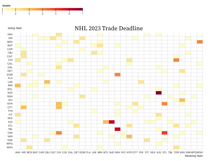
The columns on the heatmap show where teams received assets from while the rows show where teams sent assets. The color shows the number of assets received or sent to each team.
This visualization quickly highlights some of the largest trades that occurred, shown in the darker colors. SJS-NJD (Meier trade), NSH-TBL (Jeannot trade), STL-TOR (O’Reilly trade), STL-NYR (Tarasenko trade), NSH-EDM (Ekholm trade), TOR-CHI (McCabe / Lafferty trade), and WSH-BOS (Orlov / Hathaway trade) immediately standout. However, some more insights can be gained by looking at the rows and columns individually.
For example, the Florida Panthers were not active at all in this time frame. The did not sell or buy any assets, as both their row and column are empty. At the time of this writing, the Panthers have 66 points and are 4 points back of a wild card spot in the East. Seeing the visualization above prompted me to take a quick look at their CapFriendly page. One possible explanation could be that the Panthers currently do not have any cap space available. Hence, buying would have been quite difficult. This is compounded by the fact that they do not have their 1st round pick, a common selling piece to buy deadline assets, for the next 3 years. In terms of selling, the Panthers only have a few expiring contracts this summer. Some of the notable ones include Eric Staal, Marc Staal, and Radko Gudas. Perhaps there simply was not a market for these players as better options, such as Mattias Ekholm and Ryan O’Reilly, were available for teams that are buying. Plus, with Florida being in the Atlantic division, along with major buyers Toronto and Boston, and NHL GM’s general dislike of inter-division trades, finding a dance partner may have proven too daunting for the Panthers this year.
At the opposite end of the spectrum, Arizona, Minnesota, San Jose, and Toronto (and others) looked very busy at the deadline, with many transactions appearing in both their respective row and column. This indicates that these teams were both receiving and sending out many assets. In order to get more insight into these teams movements, I split the heatmap into trades involving picks and trades involving players.

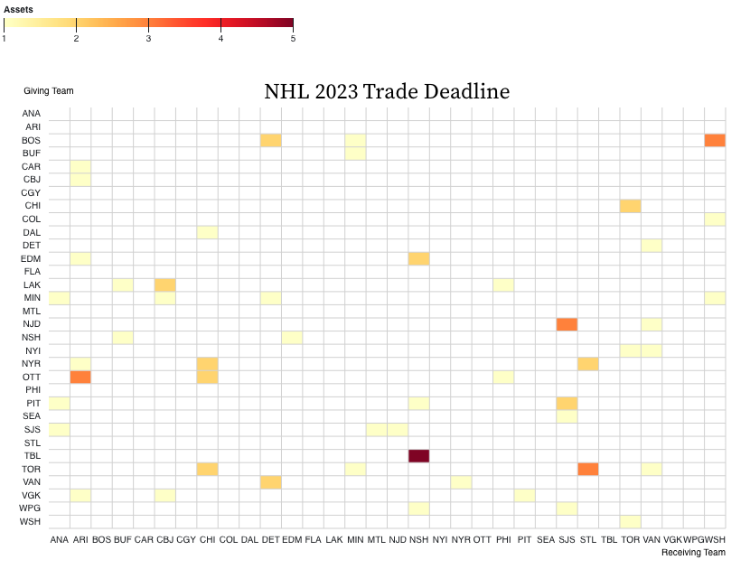
These visualization unlock further insights. Looking at the darker spots in the Player chart, the Devils received many players from San Jose including Timo Meier, one of the biggest transactions at the deadline. However, there is a slightly more orangish cell symmetrically across the diagonal, showing that San Jose received a fair amount of players from New Jersey as well. However, the true value for San Jose is shown in the Picks heatmap, where San Jose scored one of the bigger haul of picks at the deadline. The only darker spots are the picks St. Louis received for Ryan O’Reilly and Noel Acciari, and the king’s ransom of picks Nashville received for Tanner Jeannot.
Looking at the columns and rows clearly also shows which teams were sellers and buyers. Arizona and Chicago turned players (many transactions in their row in the Player map) into picks (many transactions in their column in the Pick map). Toronto and Tampa Bay did the opposite, turning their future assets into players they can use now. Tampa is actually an interesting team to look at overall. They only brought in two players, but sent out several picks to do so. This has been a recurring pattern for them the past few years, and they have made 3 finals in a row, so it seems to be working. But it is interesting how their strategy differs from rivals like Toronto and Boston.
Improvement in the data here can offer even more insight. Right now, only the number of assets are visualized. Adding in some measure of quality can help visualize the trades even better, and help good trades stand out from poor ones. Another aspect of this is the salary cap, where transactions may be helped or hindered by a team’s available funds.
These charts currently serve as a neat way to visualize a lot of data and time at once, and gain insights into general trends. Individual transactions and trades can be examined with some improvement in data collection. I will continue iterating on this project to see how these visuals can evolve.

One thought on “Visualizing the 2023 NHL Trade Deadline”