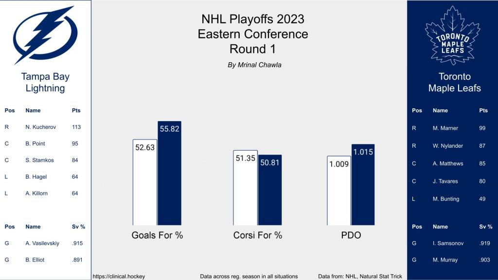
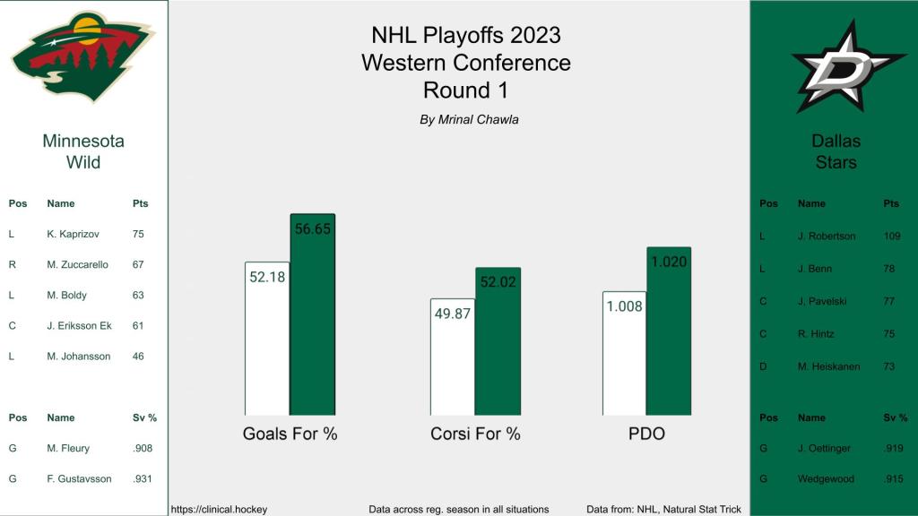
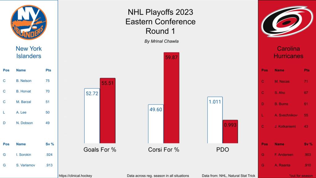
As an exercise in data visualization, I wanted to create a card that would summarize the matchup for each playoff series in the NHL. The goal was that an individual should be able to look at the card, absorb some general stats about each team, and make a decision on how they think the series will go. The resulting visuals are included in the gallery below and include the top players from each team and a few advanced statistics. The bar graphs have ranges set to just below and above the NHL min and max for the included statistics. The scales on the bar charts are consistent across the matchups as well to allow for comparison across teams on different cards. Enjoy the visualizations below and get excited for the NHL playoffs!